Your complete guide to Aura Theme on HubSpot CMS — installation, theme settings, templates, 50 modules, 18 drag-and-drop sections, blog setup, and troubleshooting. Interactive docs with screenshots and step-by-step walkthroughs.
Built by Chetan Kumar · MIT licensed · 23+ templates · 50 modules · 18 DnD sections
Use the sidebar search to filter topics, or scroll to watch the reading progress bar. Every section includes screenshots and marketer-friendly instructions — no code required.
Installation
Get Aura Theme live on your HubSpot portal in a few minutes. These steps assume you have already installed the theme from the Template Marketplace or uploaded it via the CLI.
1
Open Themes & Modules — Go to Settings → Tools → Website → Themes & Modules and confirm Aura Theme appears in your library.
2
Set as active theme — Select Aura and click Set as active theme for the domain or specific pages you want to use it on.
Configure blog templates — Go to Settings → Website → Blog → Templates and assign Blog Listing and Blog Post.
5
Open the Style Guide — Create a page with the Style Guide template to preview colors, buttons, and typography tied to your global settings.
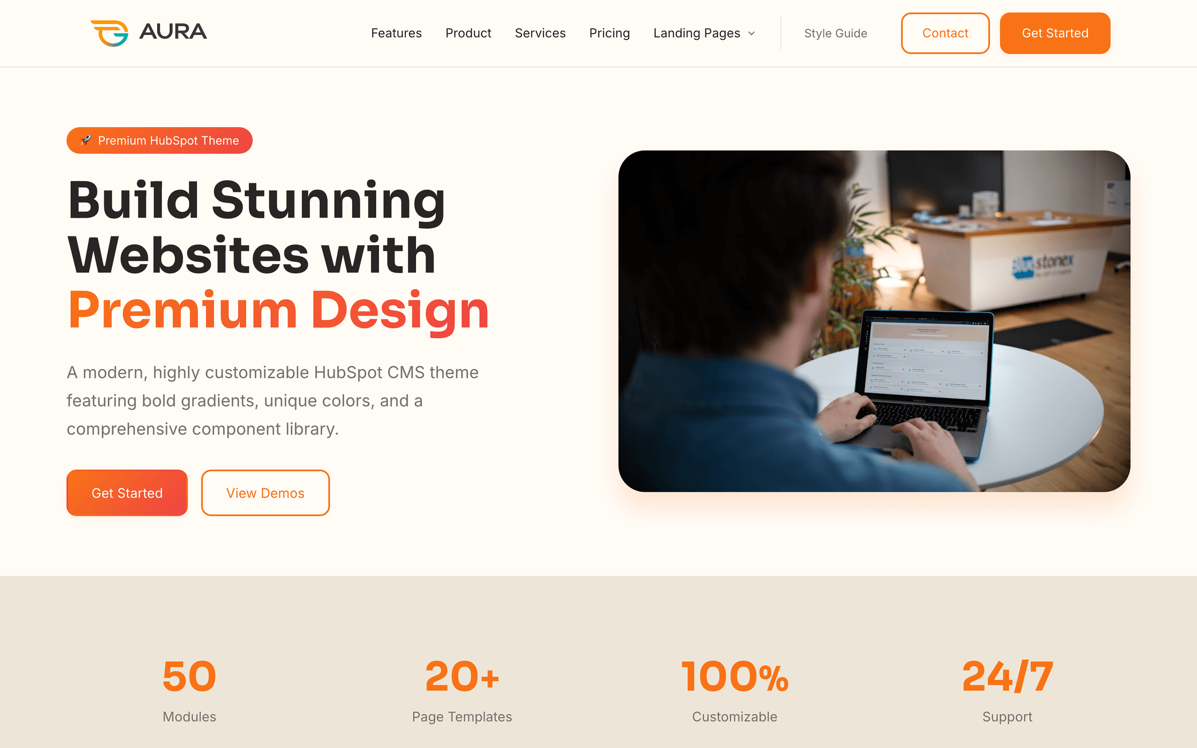
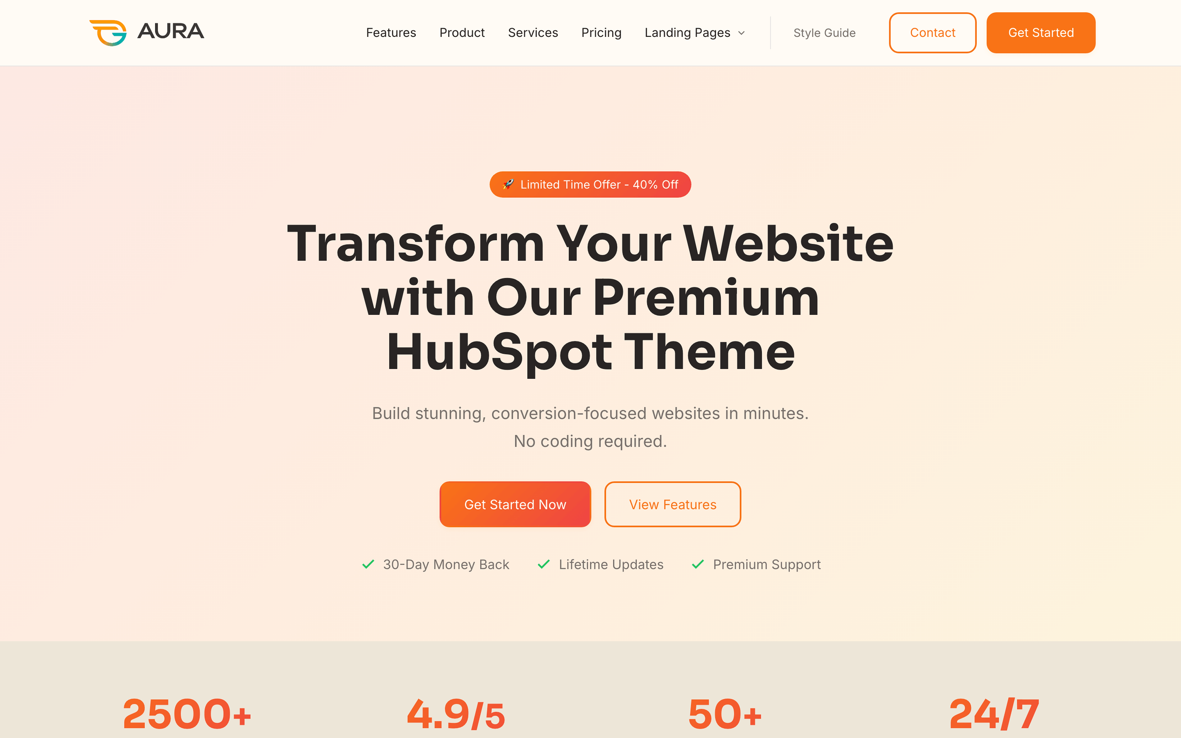
The Home template — hero, stats, features, testimonials, pricing preview, FAQ, and CTA sections out of the box.
Pro tip
Jump to the Theme settings section below for a step-by-step walkthrough of colors, typography, layout, and marketplace compliance.
Theme settings
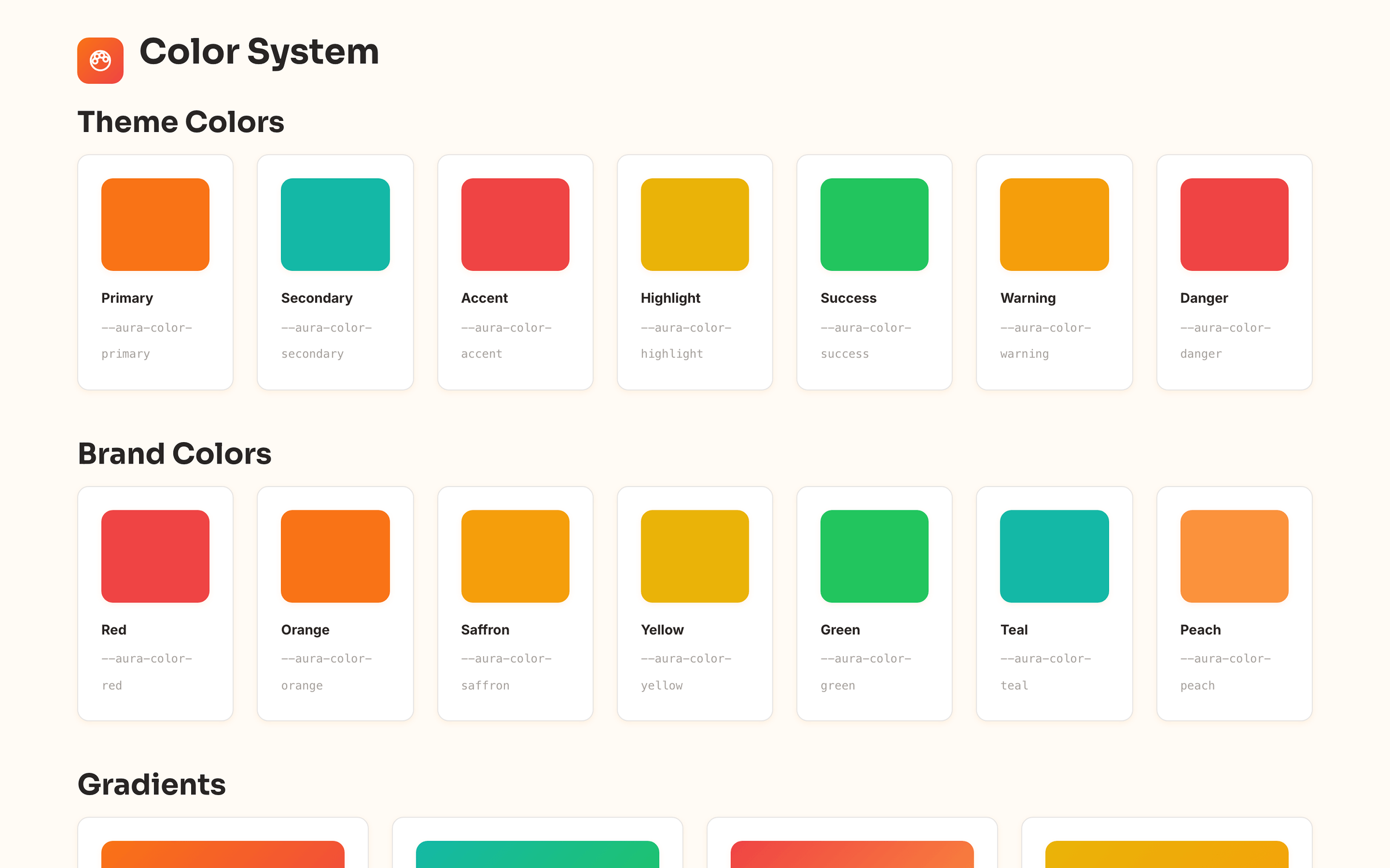
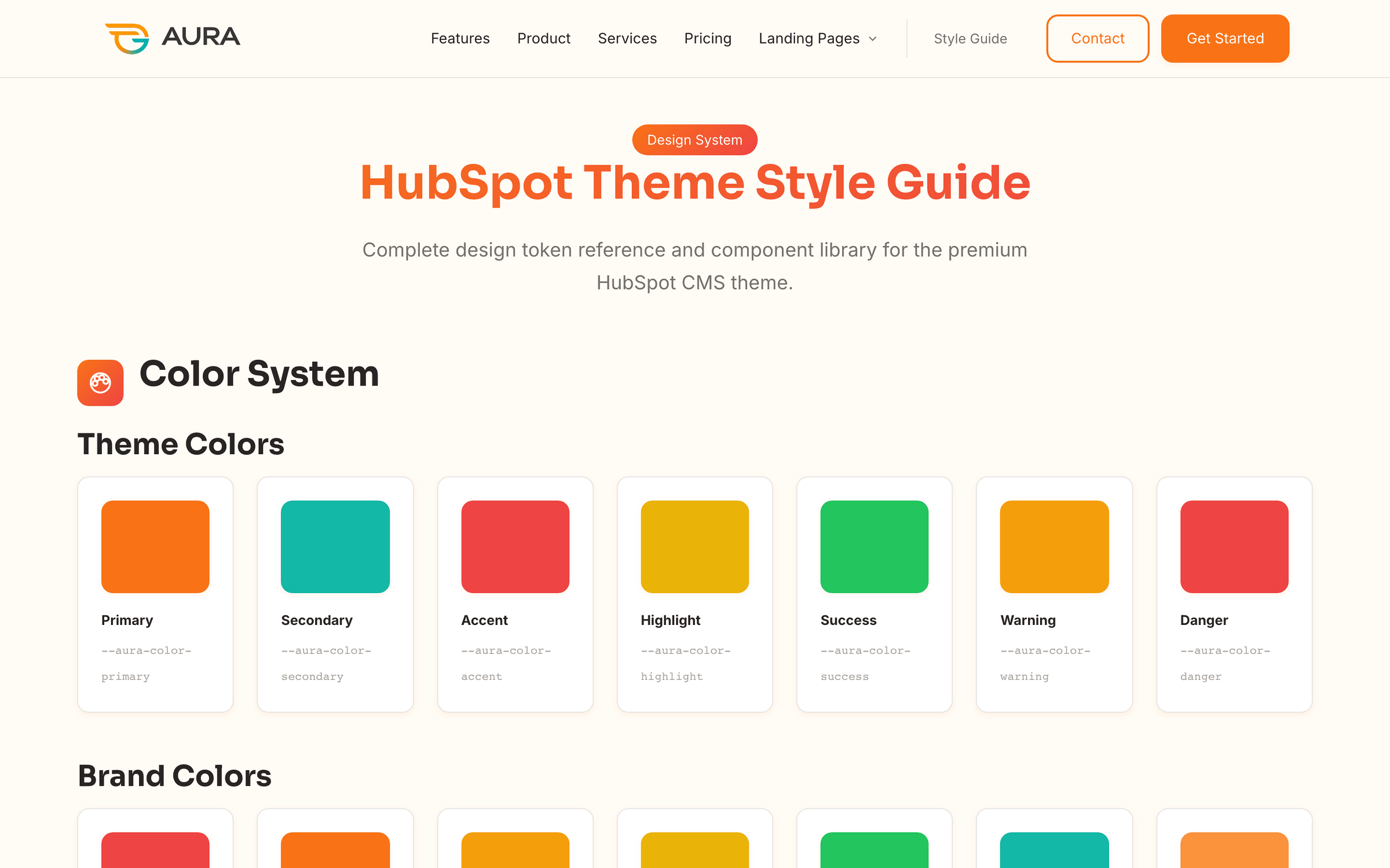
Aura centralizes branding in Design → Theme settings (or Edit → Theme: Aura Theme from any page). Changes cascade site-wide unless a module overrides them in its Style tab.
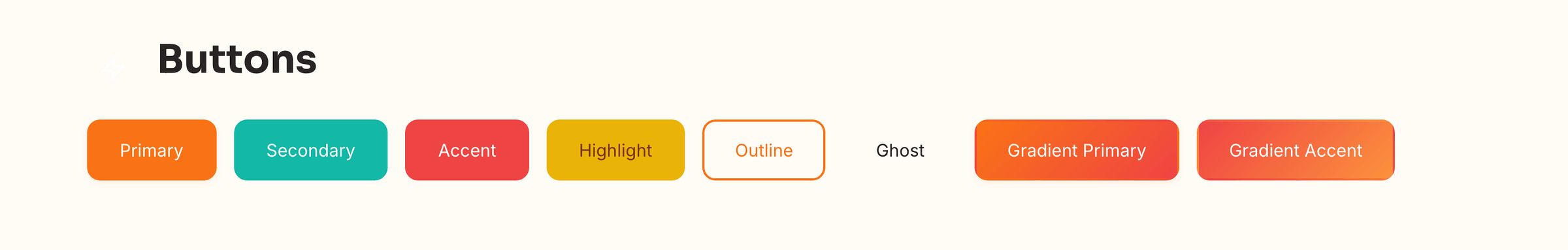
Theme settings control colors, fonts, spacing, and component tokens from one panel — no code required.
Token
Default
Used for
Primary
#F97316
Buttons, links, accents, gradients
Secondary
#14B8A6
Secondary buttons, badges, highlights
Background
#FFFBF5
Page canvas, warm off-white surface
Surface / Card
#EDE6D8 / white
Section backgrounds, elevated cards
Text tiers
Stone palette
Headings, body, muted captions
All colors map to CSS custom properties (--aura-color-*) so modules inherit updates instantly after publish.
Heading font: Sora (Google Fonts) — geometric, modern display type
Body font: Inter — optimized for UI and long-form reading
Configurable base size, heading weight, and H1–H6 scale
Line height and letter-spacing tokens for section headers vs. body copy
Content width — default 1280px max container
Section padding — default 72px vertical rhythm
Border radius — shared across buttons, cards, and inputs
Shadows — card, hover, and floating elevation presets
Live Style Guide template reflects every token — update theme settings and watch components update in real time.
Header & footer
Aura uses two global modules on every page and blog template. Edit once — changes propagate everywhere.
Site Header
Logo upload (SVG or PNG, ~48px max height recommended)
HubSpot Navigation Menu field — supports nested child and sub-child items with dropdowns
Utility link plus up to two CTA buttons (primary / outline)
Sticky header toggle and mobile hamburger with slide-down panel
Edit via Design Manager → Global modules → Site Header, or click the header on any page in the editor.
Site Footer
Logo, short description, and social icon links
Repeater link columns — Product, Company, Resources, Legal
Newsletter form area and customizable copyright line
Global header & footer on the Contact template
Consistent navigation across all marketing pages
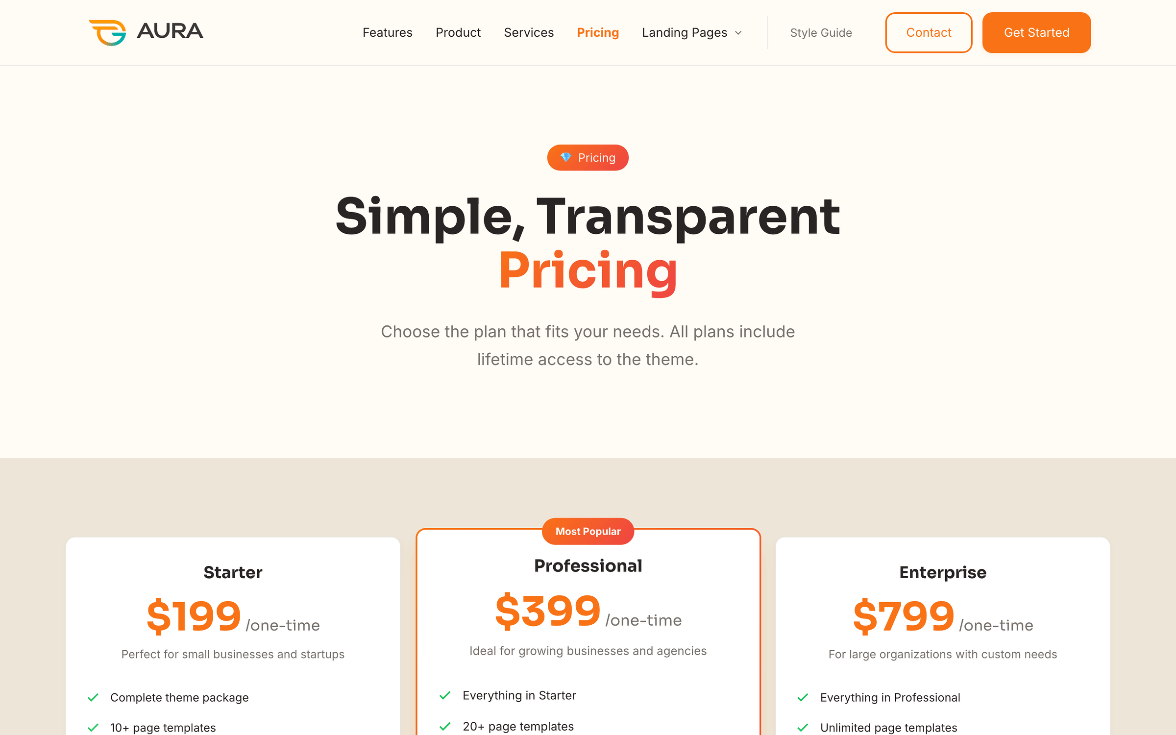
Page templates
Aura ships with 23+ templates — marketing pages, conversion landings, blog, system pages, and documentation. Assign per page under Settings → Advanced → Template.
Category
Templates
Best for
Marketing
Home, About, Features, Product, Services, Pricing, Team, Careers, Contact, FAQ, Case Study
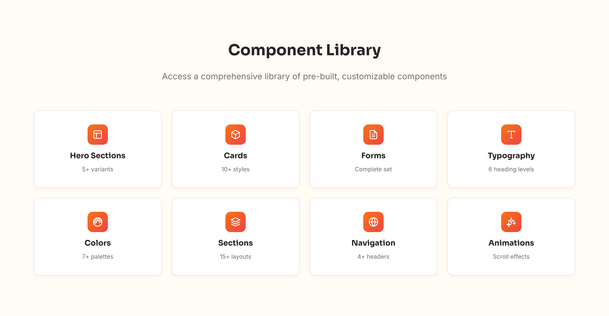
Aura includes 50 custom modules (48 content + 2 global header/footer). Each module has content fields and a Style tab for layout variants, spacing, and background overrides.
50 aura-* modules — hero, stats, pricing, FAQ, testimonials, lead capture, and style guide components. Each module has content fields and a Style tab for layout variants.
Shared modules
Editing a module file (e.g. aura-conversion-split) updates every page and section that uses it. For page-specific copy, edit the module instance in the page editor — not the module source in Design Manager unless you intend a global design change.
Drag-and-drop sections
Click + Add section in the page editor to insert 18 pre-built Aura sections. Sections bundle modules with consistent spacing and backgrounds — ideal for marketers composing pages visually.
Hero with Form, Landing Hero Neon, Conversion Split, Lead Capture
Features Grid, Stats Row, Image with Text, Use Cases, CTA Banner
Pricing, Testimonials, FAQ Page, Contact Form & Info
Team Grid, Case Study — Intro, Case Study — Challenge & Solution
Sections appear in the HubSpot section picker — each is a curated stack of Aura modules with theme-aligned spacing.
Blog
Assign templates
1
Go to Settings → Website → Blog.
2
Set listing template to Blog Listing and post template to Blog Post.
3
Publish a test post with tags and a meta description to preview cards and filters.
Blog Listing — live tag filter pills and featured post
Blog Post — breadcrumbs, sidebar TOC, author card, share links, comments, and related posts
Tag filters
Filters use HubSpot's blog_tags() — assign tags to posts and they appear as filter pills automatically. No manual configuration required.
Card excerpts
Listing card excerpts pull from each post's meta description. Add meta descriptions in post settings for polished preview cards.
Forms
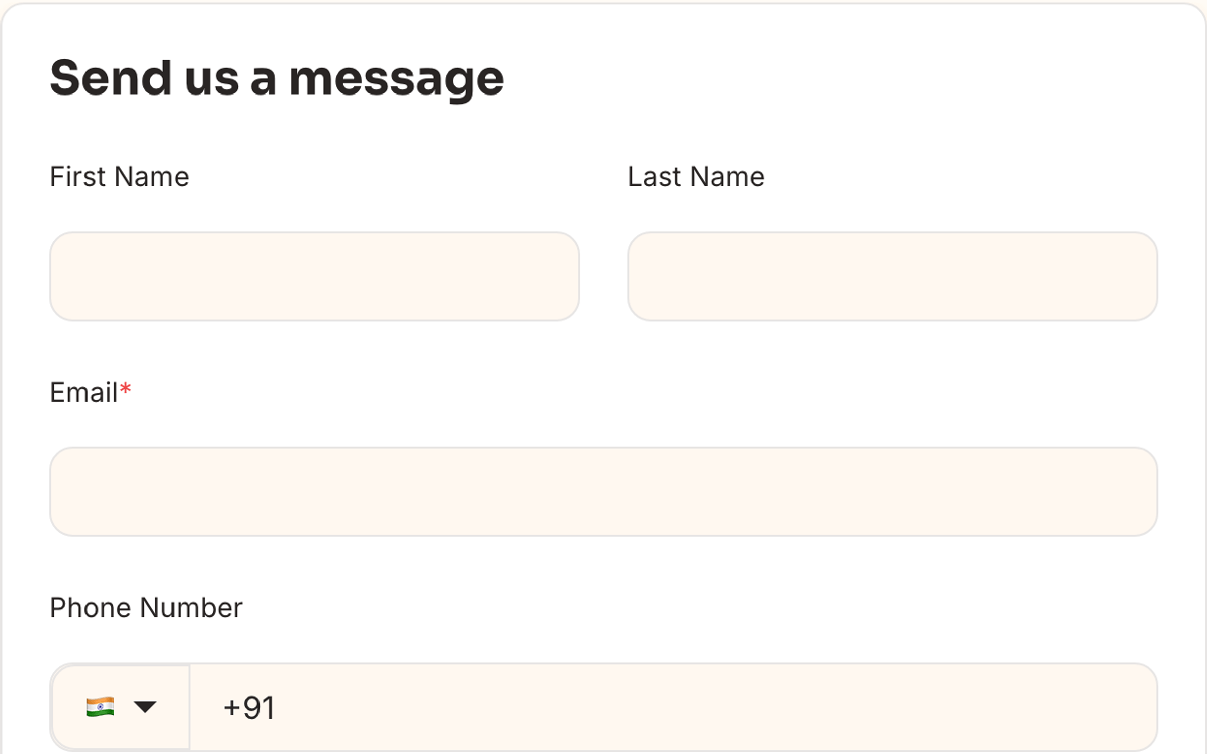
Aura styles both legacy HubSpot forms (.hs-form) and the new form editor (hsfc-* classes). Form appearance inherits button radius, input borders, and focus rings from theme settings.
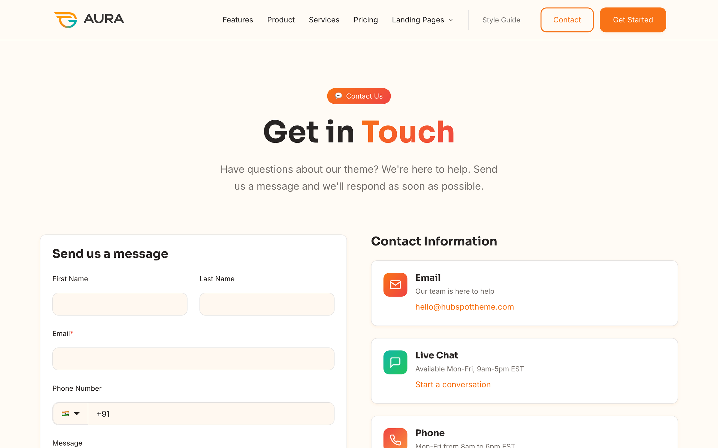
Contact page — Contact Form & Info module with side-by-side layout
Landing pages — Lead Capture and Conversion Split modules
Hero with Form section — native HubSpot form in a hero layout
Footer — optional newsletter form in Site Footer global module
Forms pick up global button styles, input radius, and focus states from theme settings.
Tables
Aura applies consistent table styling across blog posts, rich text modules, documentation pages, and the Style Guide. Customize appearance under Theme Settings → Tables.
Header style — solid fill, gradient, or minimal underline
Layout — border width, corner radius, and cell padding
Interaction — optional striped rows and row hover highlight
Wrap custom HTML tables in <div class="aura-table-wrap"> for horizontal scroll on small screens. Tables inserted via the rich text editor are styled automatically.
Style guide
Create a page with the Style Guide template to preview live samples of every design token — colors, typography, spacing, buttons, badges, cards, form elements, tables, and alerts. All components are wired to global theme settings.
Use this page as your brand QA checklist — change a theme setting, refresh, and confirm every component updated.
Recommended workflow: keep a draft Style Guide page open in one tab and Theme Settings in another. Use View on in the settings panel to preview changes on different templates before publishing.
Troubleshooting
Common issues and quick fixes. Expand each item for details.
Theme settings changes not visible
Hard-refresh the preview (Cmd+Shift+R / Ctrl+Shift+R).
Republish the page after saving theme settings.
Check if a module Style tab overrides the global background or colors.
Clear HubSpot CDN cache by republishing the theme from Design Manager.
Blog tag filters are empty
Confirm posts have tags assigned in the blog editor.
Verify Blog Listing is set as the blog listing template.
Publish at least one tagged post — draft-only tags may not appear in filters.
Forms look unstyled
Ensure the form is a HubSpot form (not a raw HTML embed).
New form editor forms use hsfc-* classes — Aura includes styles for both editors.
Check that the page uses an Aura template (system form CSS loads with the theme).
Mobile layout issues
The Aura mobile breakpoint is 767px. Preview at 375px and 477px in HubSpot responsive mode. The header collapses to a hamburger menu; multi-column grids stack to single column.
Module changes affected other pages
Modules are shared assets. Editing module source in Design Manager updates every instance. For page-specific content, edit the module instance in the page editor fields — not the module HTML/CSS files.
Support
Free support is included with your Aura Theme purchase. Reach out for setup help, customization guidance, or licensing questions.